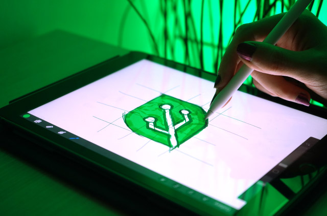
How We Designed a Custom Logo to Differentiate Our Brand
Your logo is a visual representation of your business — what it is, what it stands for. A well-designed logo not only identifies your brand but builds customer trust and loyalty to your business. Though there are scores of websites where you can buy a quickly designed logo for a few bucks, I'd caution against that. As easy as this seems, there are huge benefits to creating your own.
Your Chance to Stand Out
"With a template logo you are not getting anything custom or unique to your business," according to content marketing studio Atomic55. "In most cases with a template logo, you are going to get a logo that is exactly like or similar to another business, as they may have purchased the same logo."
And what business wants to look like everyone else?
Certainly not Integrated Computer Solutions (ICS). The software firm wanted a custom logo for its new rapid-development software solution called GreenHouse by ICS. The original logo was designed by the software developer who created GreenHouse. He needed a simple placeholder while working on the project. In making a logo, he took a literal approach with the name and designed an array of veiny leaves fanning out, with each leaf having a unique color.

As this logo was never intended for use outside the company, it was created without study or design best practices. That's why, as the GreenHouse project moved toward completion, the visual design team at Boston UX (ICS' design studio) was brought in to formally develop a consumer-facing logo.
This process involved pairing strategic thinking with design excellence to create strong brand awareness. Here's an overview of our thinking during that process — insight that may be helpful to you if you decide to create a logo for your brand.
Start with a Clear Understanding
In order to effectively brand GreenHouse, our design team needed to understand precisely what makes a winning logo in the realm of software and technology. That's why we started the design process by examining logos of some of the world's most recognized brands, including Amazon and Google. Here's what we learned, starting with one of the most iconic logos of all.
Apple
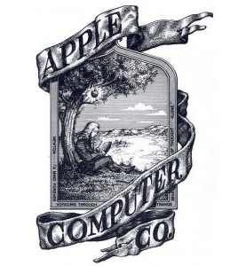
Apple has benefited from simplifying its 1976 logo into what it is today. The original logo's text lays on a ribbon wrapping around an illustration of Isaac Newton right before he gets hit on the head with an apple. Today, the logo is reduced to a single apple. The gray apple can be easily replicated, is easily recognizable, and is visually distinct compared to a complicated illustration.
Amazon
Amazon's arcing gold arrow guides us from A to Z.... communicating to us that we can buy anything here, from A to Z. The gold arrow is curved, implying a smile.
Google's vibrant logo is memorable due to how many colors it has compared to most other logos, which typically have just 1-2 colors.

Twitter breaks the language barrier by telling the story of a little blue bird with an open mouth; an abstraction of individual Twitter users as little bluebirds who "tweet" whatever is on their mind.
Apply Knowledge to GreenHouse
GreenHouse is software, and software is not something that can easily be visually represented. Physical associations of software are hardware and user interfaces, but these are only the shell that the actual software resides in. So how do we visually represent the software tools that developers, designers and project managers use to create the software used in embedded devices like ventilators and automotive infotainment systems?
Iterate with Design Team
The team created over 50 different unique logo designs. Starting with a large number of ideas allowed us to more easily evaluate which ideas work and which don't. We started with black and white to force the team to focus on shape and form before color. We explored representing themes of growth, progress, elevation, collaboration and connection.
These messages are at the core of what GreenHouse is — a new, more efficient way to work with a development team in order to create embedded touchscreen software.Here are a few of our early designs:
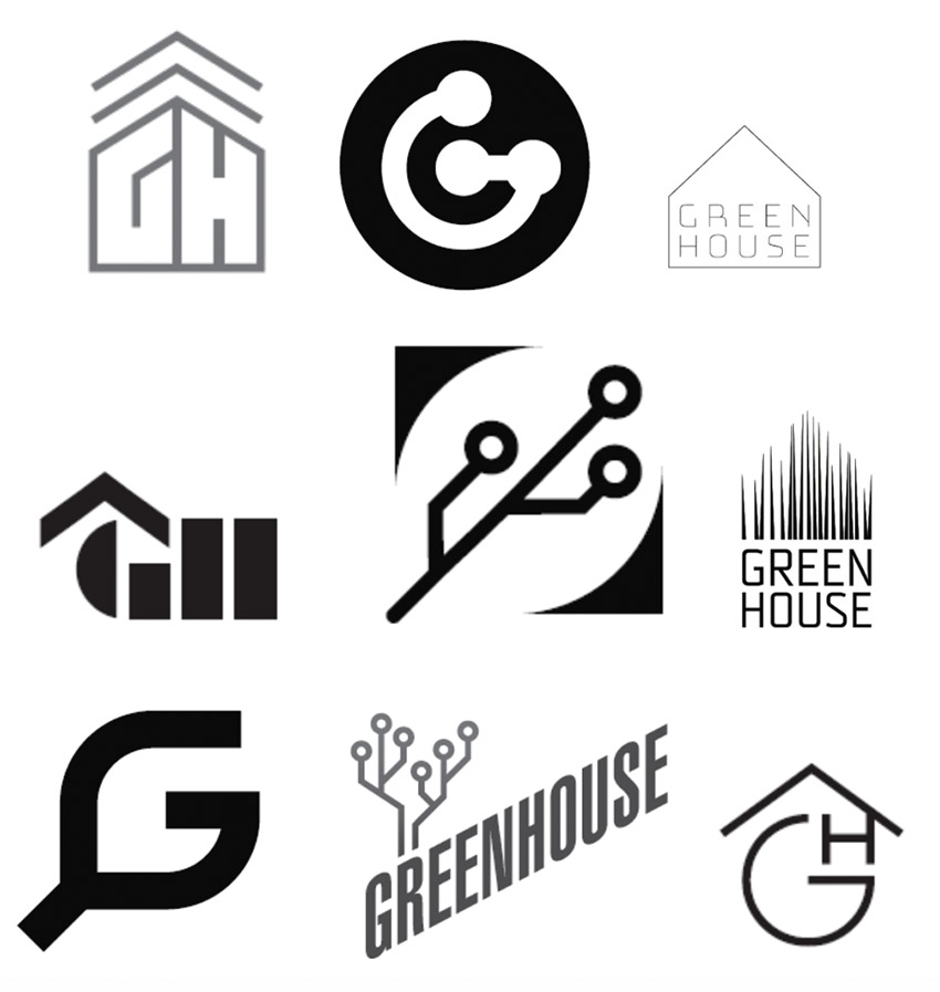
We quickly culled the "house" ideas that popped up. There wasn't much reason to have the "house" repeated from the logo, so we cut any logos with "upwards" facing arrows.Then we curated the options into these final three, which we felt captured GreenHouse's identity:
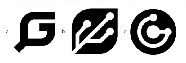
Option A:The letter "G" is shaped like a leaf. We created the G by sculpting a square into a G and then adding a "stem" to imply a leaf.
Option B:A circuit board on a leaf shape. The leaf is made by dramatically rounding two opposite corners of a square and making a design out of some negative space on the inside.
Option C: A stylized G shape with three "nodes" on each endpoint or the sharp edge of the G.
After further analysis and discussion, the team reduced the options to those with the following qualities:
G Shape (Options A and C)
Since we are stripping away any text from the initial logo, we agreed that a monogram "G" (for GreenHouse) is a useful device for easy understanding. Being straightforward in our communication is a helpful way of reminding our audience of the product's name.
Ecological Imagery (Options A and B)
ICS' vision for GreenHouse is that it "grows" projects, similar to how a traditional greenhouse grows plants. One powerful way for a software brand to stand out is to marry it to a concept that exists "organically" in the world. We decided that an ecological theme would be an effective way to communicate growth.
Technology Imagery (B and C)
The bottom line is that GreenHouse is a software for developing software; it's as technology-oriented as you can get. An easily recognizable way of communicating "tech" is to abstract the designs on a circuit board. Circuit board patterns are very flexible and can be abstracted into nearly any shape.
Symbol Only (B)
Research shows that images are much easier to remember than plain, unformatted text. In this example, a leaf has veins that are shaped like a circuit board. This combines two important visual themes: technology and ecology.
Choose the Winner
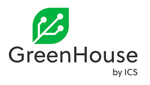
After much discussion, our team concluded that option B — the "techno leaf" — was the strongest option as it effectively communicated our message. At this point, the logo was ready to be rendered in color. We chose an inviting green that paired well with the purple color ICS uses in its corporate logo.

And finally we were ready to execute a typography treatment so that the logo would be flexible for use in a variety of situations. We selected a font that complements ICS ' corporate font. From the logo, we are able to create a brand guideline specifying which typography to use with this logo, as well as identify graphic elements that enhance the messaging.
As GreenHouse moved from a simple idea to working software, so too has the logo gone from concept to reality. Designing this logo was a long and meticulous process that I think was worth the effort.
© 2020 Integrated Computer Solutions, Inc. ICS makes no claim to the logos discussed in this article.
