Determining the Optimal Touch Target Size is a 3D Problem
If you're designing a natural user interface (NUI) you want to facilitate effortless interactions. It may seem obvious, but it bears stating: touch target size affects usability. Small targets are more difficult to hit because they require greater accuracy — hence effort — on the part of a user. So, given that screen real estate can be tight, how do you choose minimum target sizes?
Creating a Finger-Friendly Design
Fingers come in different sizes, of course, so although you can find recommended minimum touch target sizes with a quick Google search, they'll vary between .5 to 2 cm because pure x,y measurements are not all there is to target size. (When stating general touch target sizes, using physical measurements makes sense, given the variety of screen resolutions possible on embedded and Internet of Thing devices.)
Beyond these general guidelines, there are some tricks to play with target sizes to enhance usability without sacrificing a pleasing layout. For instance, a visual touch target does not have to match the actual touch target area. You can use this to your advantage.
For example, you could have a row of .5 cm x .5 cm icons, spaced out to have 1.25 cm between them. Visually they look nice, spacious and minimal. But you can implement a target size that's larger than each icon, say 1 cm x 1 cm. This still gives you .25 cm between the touch targets. This sleight of hand makes it easier to tap the icon without exact precision yet still get the interactive response.
But if you think that's all there is to target size you'll be surprised to learn there a third dimension for you to explore. How? Try this experiment:
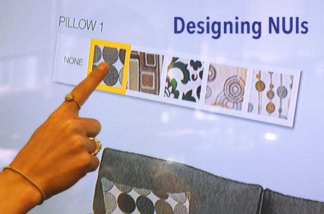
Grab your smart phone and find an icon or button that is roughly .75 cm x .75 cm. Now do some interacting on your phone using that icon/button. What does it feels like? How easy or difficult it is to interact with?
Next, find a large screen — the larger the better, but at least 30 inches. Put that same size icon on the screen (you can cut up a sticky note to simulate it) in the same location. Interact with the screen. (Pretend to do so if the screen is not actually touch.) Include tapping your icon. Feel what that's like.
What differences did you notice? Most likely that tapping on the target on the large screen is slightly more difficult and requires more effort than tapping it on your phone. There's an explanation for this: Fitts' Law.
Understanding Fitts' Law
Fitts' Law is a predictive model of human movement primarily used in ergonomic and computer interface design. It states that the time needed to quickly move to a target area is a function of the ratio between the distance to the target and the width of the target. In other words, the farther your hand is from the screen prior to hitting the target, and the more your arm is involved, the more challenging it is to hit a small target.
While holding a phone with your fingers an inch from the screen, tapping a small target is not so hard. But, when you're sitting or standing at a larger screen, not so much. Think about it: you move your hand from your side, a foot from the screen, toward the target. You have to literally slow down right before you tap in order to align on the target. It takes extra concentration and extra milliseconds, something no user wants.
This is why I call target size a three-dimensional problem. The size of the screen, which affects the distance the user sits or stands from the screen, makes a difference in comfortable target size. I could go a step further and argue that target size is actually a four-dimensional problem: context of use and frequency of use also influence the appropriate target size.
It's one thing to have a device set up with the ideal placement for interacting, the way most ATM machines are. Their screens are at hand height. But, imagine if a medical device to monitor a patient's vitals is placed high atop a monitoring device at slightly above eye level. You'd need to raise your arms and reach to interact. Hitting targets on devices in less-than-ideal places increases the challenge.
So, my rule of thumb (pun intended) is: make touch targets as large as you possibly can. This is especially critical for a target that is used frequently. It should be super easy to hit. One reason swipe is preferred over tapping on a touchscreen is that accuracy is not such an issue. Usually a swipe gesture allows the user to engage with the screen over a large area and use more than one finger.
Bottom Line
Don't be stingy. Give users generous targets with which to interact. Be bold and let the user use two, even three, fingers to interact. That's much more natural for the hand than the index finger or middle finger alone. (The thumb, on a phone, is happy interacting by itself.) Creating a successful NUI, one users will truly enjoy, takes close attention to detail and a good understanding of how hands actually interact with screens. And yes, size matters.
Here's more great UX design content.