
Why Has the IoT Gone Button Crazy?
With the Internet of Things (IoT) and the rise in touchscreen interfaces on devices, virtual control panels are popping up everywhere, from in-vehicle infotainment (IVI) systems to medical devices. The interactive experiences they offer can be attractive and advantageous over their legacy physical counterparts, but so often they are not. One key reason: the ubiquitous button. Virtual buttons are being so overused these days, to the point of becoming a scourge. Yet, I can just hear people shouting, "Now that we can use our hands to control our devices, shouldn’t we have more buttons, not fewer?"
In a word, no. Not if we're striving for natural, frictionless interactive experiences. Let me explain.
An Appreciation for Machine Controls
Virtual buttons — meaning a hotspot that requires mouse clicking or finger tapping — are an inherent part of any graphical user interface (GUI), which is essentially a mashup of information design and machine controls. For years we have used virtual buttons with a mouse or other mechanical pointer in desktop applications and web pages. These buttons were a natural evolution of the physical machine interfaces present on early mainframe computers.
I have a robust appreciation for machine controls. I grew up with a pre-computer electronic hobbyist parent. My dad’s basement workshop was full of radios and TVs with their guts spilled out. He had whining oscilloscopes, smoking soldering irons and a vast array of chattering ham radio equipment.
I loved hanging out there, not for the engineering aspect but for the aesthetics and ergonomics. I would spin every knob and push every button. My favorite were the bold 4-inch dials on his ham radio receiver that gently snapped through the frequencies.
As a UX designer I spent the 1990s — when GUIs that imitated physical reality were popular — bringing a touch of nostalgia for machine interfaces to bear on my projects. What’s clear is that virtual buttons, whether the style is realistic looking or minimal, work well with a mouse on a GUI because clicking is the easiest action to do with a mouse. Precise aiming and selecting with a mechanical pointer on a screen is ergonomic.
But touch is different.
The Rise of Touch Interaction
One might assume that buttons and touch interaction are a happy pairing. But is tapping buttons really comfortable? Sure, the hand can handle buttons, but an excess of buttons quickly becomes tiring. Especially small buttons.
It takes effort for the hand to accurately hit a button, and small buttons make the task increasingly challenging. A lot of precise finger tapping is tiresome to the hand, so buttons are not ergonomically ideal for hands. The hand is more comfortable being in a relaxed shape, using multiple fingers in a swipe or a kind of sloppy tap on a large button. A large, hand-size button is much easier to hit than a finger-size button.
While the virtual button is a mouse-clicking success story, it doesn’t translate well to the interaction of finger tapping — even though is seems like it should at first glance. Hands like real buttons better than virtual ones because usually there is physical feedback. On a screen, hands like other kinds of gestures more than tapping. As a result, on mobile devices we have seen a rise in other kinds of interaction gestures, like swiping, that are more natural for the hand to do.
So why, on touchscreen control panels for IoT devices, are buttons making such a comeback?
I suppose it seems like an obvious thing to do. Virtual control panels require lots of “controls,” unlike a typical web page that is more about presenting information within a limited set of controls. The easy solution — although not best for the user — is for designers to go button crazy.
Compare this example (three photos, below) of a popular car brand's climate control physical controls to an early and a later version of the automaker's IVI virtual control panel. The physical controls are much easier and more natural for the hand to use than either version of the virtual controls. Why? The physical controls have dials that are easy on the hand, while the IVI control panels "buttonize" those dials, which makes them more tedious to use.
And, as UX designers we can’t ignore the fact that an IVI requires drivers to spend more time setting the controls than with old-school physical controls since drivers have to be more precise with their hands in order to hit the targets. That means there's more time when a driver’s eyes are not looking at the road. Safety hazard!
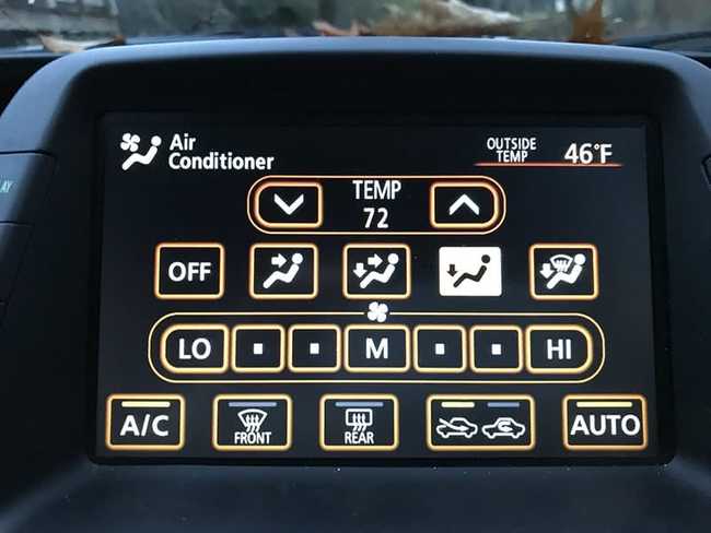
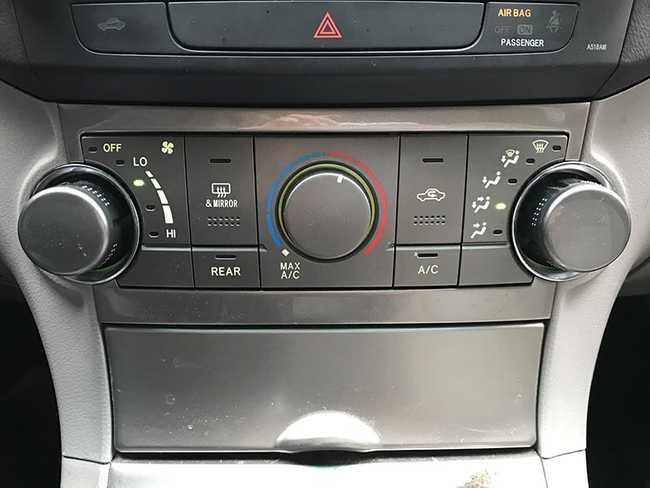
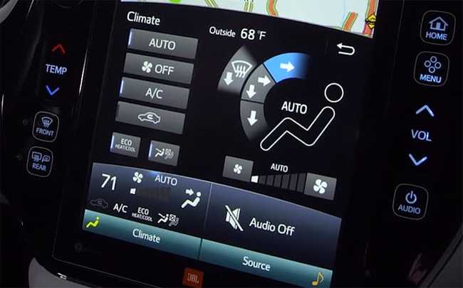
Old school physical controls, an IVI from five years ago, and a newer version of the same IVI.
It was only by borrowing some ideas from the physical knobs (top photo) that designers were able to improve upon the initial IVI (middle photo), making the controls in the more modern IVI (bottom photo) easier to understand at a glance.
What’s a Designer to Do?
If you’re designing for touch, remember this rule: use the least number of buttons possible. More specifically, avoid designing controls that require users to tap on small hot spots. In the above example, sliders and larger, strategically placed hotspots would have made for a much better user experience.
Modern UX design is all about creating a natural interface. And Natural User Interface (NUI) guidelines suggest you should, as much as possible, replace virtual controls such as buttons with virtual representations of the content itself.
Enjoy this? Read more about NUIs.